Pepsi’s rebrand reverts back to the 90’s: branding without creativity
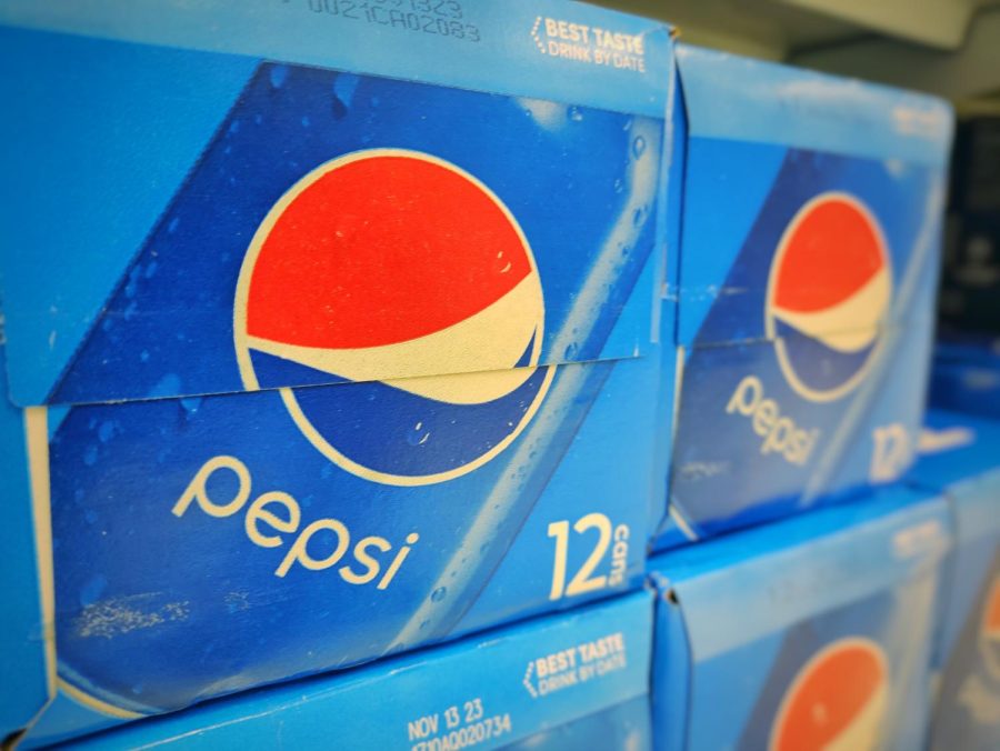
The last lines of Pepsi boxes with the old Pepsi logo are on sale at Safeway.
April 27, 2023
The iconic whoosh of red and blue sandwiches the white in a circle on a blue can with lowercase writing, “Pepsi.” Many would consider the brand and logo icononic. However, starting next year, Pepsi Co. will rebrand its logo into a retro 90s style and appeal towards their “ZERO” sodas.
“We designed the new brand identity to connect future generations with our brand’s heritage, marrying distinction from our history with contemporary elements to signal our bold vision for what’s to come,” said Mauro Porcini, SVP & Chief Design Officer of PepsiCo in a press release.
Pepsi Co.’s press release stated that the company is changing its logo to fit its 125th anniversary appropriately and to appeal to the next generation of consumers. However, reverting back to the 90s style is rather conservative than leaping to the next generation.
By reverting back to the old logo, the new logo may be hard to recognize for current consumers. The 2023 logo also contains capitalized text which conflicts with the current trends for many companies.
“I think it’s good, but I like the [2008-2022 logo] better. It’s more simple, and it’s very easily recognizable,” said Athrv Gupta (‘26).
In addition to updated text, Pepsi’s new logo displays a bright saturated color, rather than the previous calm contrasts. It also lacks the distinction it had with other companies for its blue cans and logo.
“Just two colors with a word inside. With the other logo, there’s some style to it, you know. It’s not, like, symmetrical on both sides. It’s more pleasing to the eye,” said Kyler Hu (‘25).
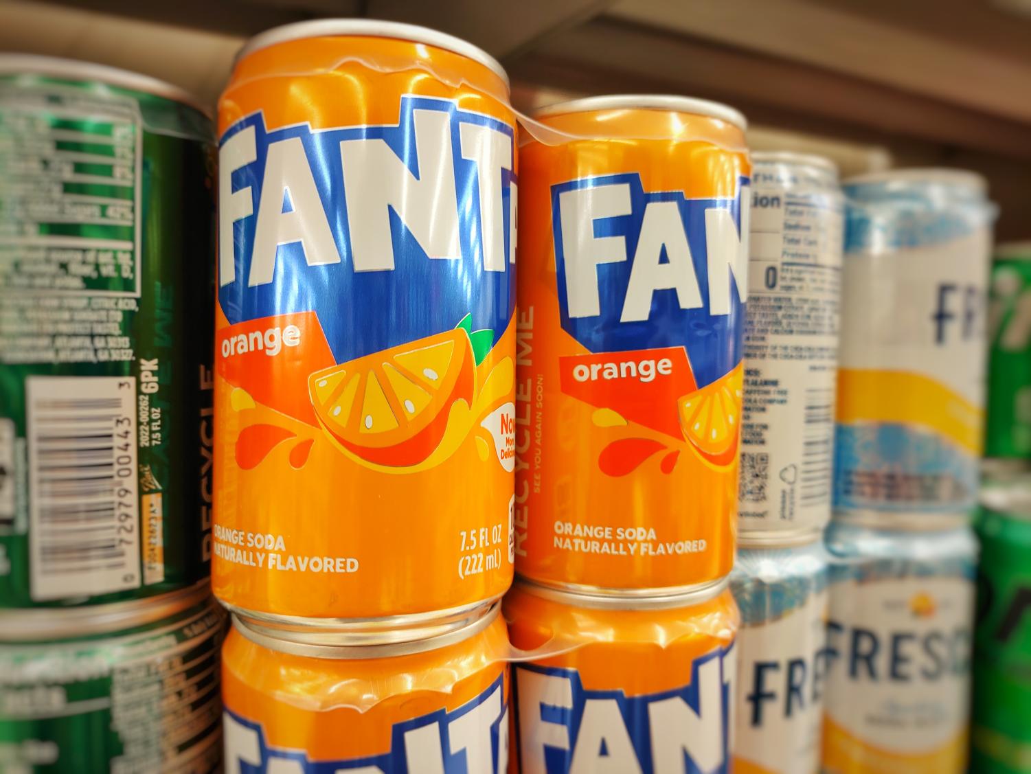
Rebranding logos into the previous styles is not limited to Pepsi. Fanta and Burger King also recently changed their logos to appeal to their new generation.
While Fanta’s new logo is still recognizable for its similarity to the previous logo, Burger King reverted their company logo to the logo used from the 70s to 90s. Simply put, Burger King’s “new” logo is also unoriginal. Though it may appeal to a new generation, the word new and conservative doesn’t align.
“[Burger King’s new logo] is not as bad as Pepsi, but I still like the old one. Like the one with the blue, since there’s more color contrast,” said Hu.


Jeanette D'Addabbo • Sep 10, 2023 at 8:39 pm
interesting approach. I thought the new logo was actually very smart as it has black which connects to zero sugar and the newer generation is about cutting out sugar just like the previous was about cutting carbs or calories. Another thing is that it is the old logo since gen-z loves old stuff and vintage idk but interesting article
Shimon Arai • Oct 21, 2023 at 10:09 pm
While I agree that it is a good strategy to connect the zero sugar with the newer generation, I don’t think all gen-z love old stuff and vintage.
Sure, some might like vintage but since Pepsi is moving forward with a different marketing strategy, I think Pepsi should create a new logo to go with it.